Entity
9 Mar – 19 May 2017

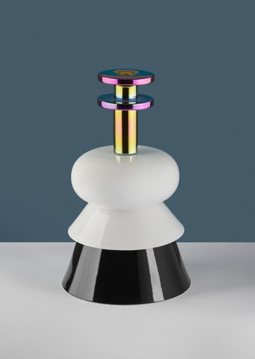
Objects from the Superior typography studio react in a witty manner to the term “font foundry” – but the cast letters aren’t made of lead like in the printing industry’s old days. Their shape has undergone an abstract transformation. Where did these objects get their shape? Every letter of Vojtěch’s custom Vegan Sans alphabet was rotated around its left axis on a potter’s wheel, cast, and glazed. Extruding the font into 3D reacts to digitization, which greatly simplified the tools for font creation.
The commercial collection of objects was designed in several glaze colours. Through their approach, Superior Objects transport typography into the area of applied art and fine art objects. The letters are given a new dimension and qualities that can be appreciated in every interior.
The opening took place on 9 March, 7 p.m.
